Getting the right content to the users as simply as possible.
MLB.TV is a cross-platform product allowing baseball fans to stream live and archived games on demand. MLB.TV brought massive innovation to the streaming market by providing realtime content to baseball fans years before other competitors.
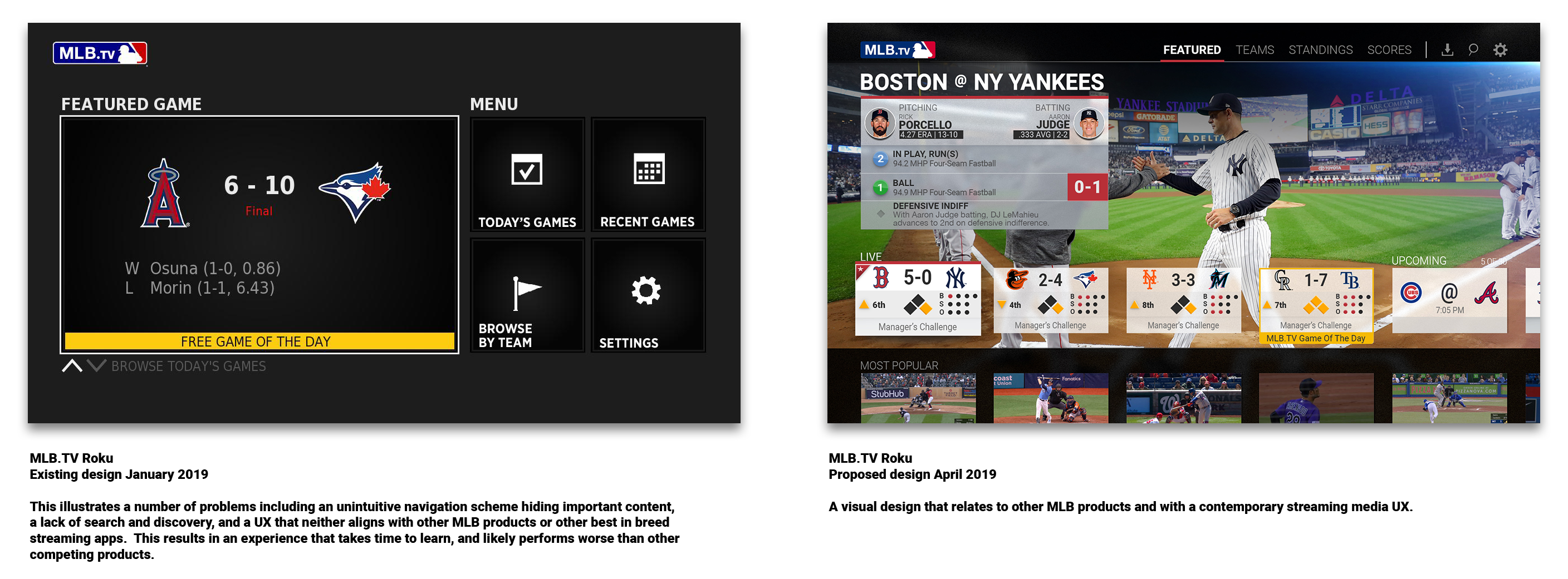
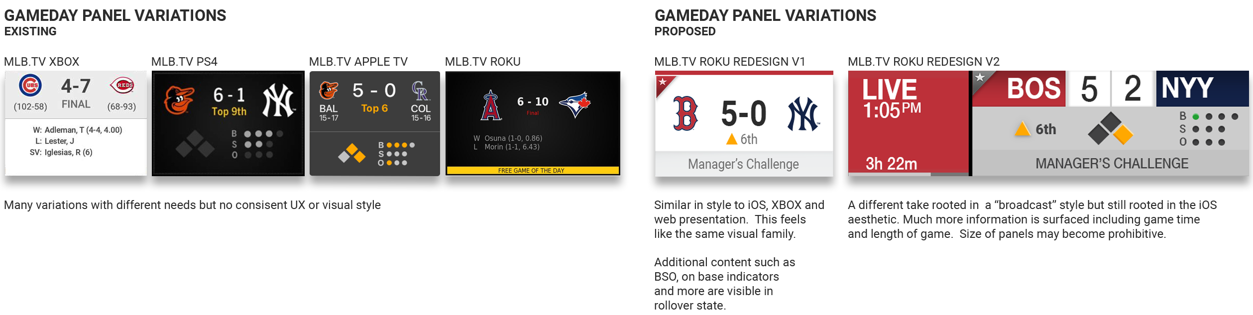
While the product is favorably received with over 1.5mil paid subscribers, it has a dated TVOS UX, limited content with poor discovery, and lacks a compelling, modern, polished design.
CREDITS:
Creative Director
Alexander Reyna
Role
UX/UI, Visual and Motion design
Goals:
Refine and modernize MLB.TV to improve presentation, content variety, user engagement metrics and annual subscriptions.
This was product redefinition from the ground up.
Target Demographic
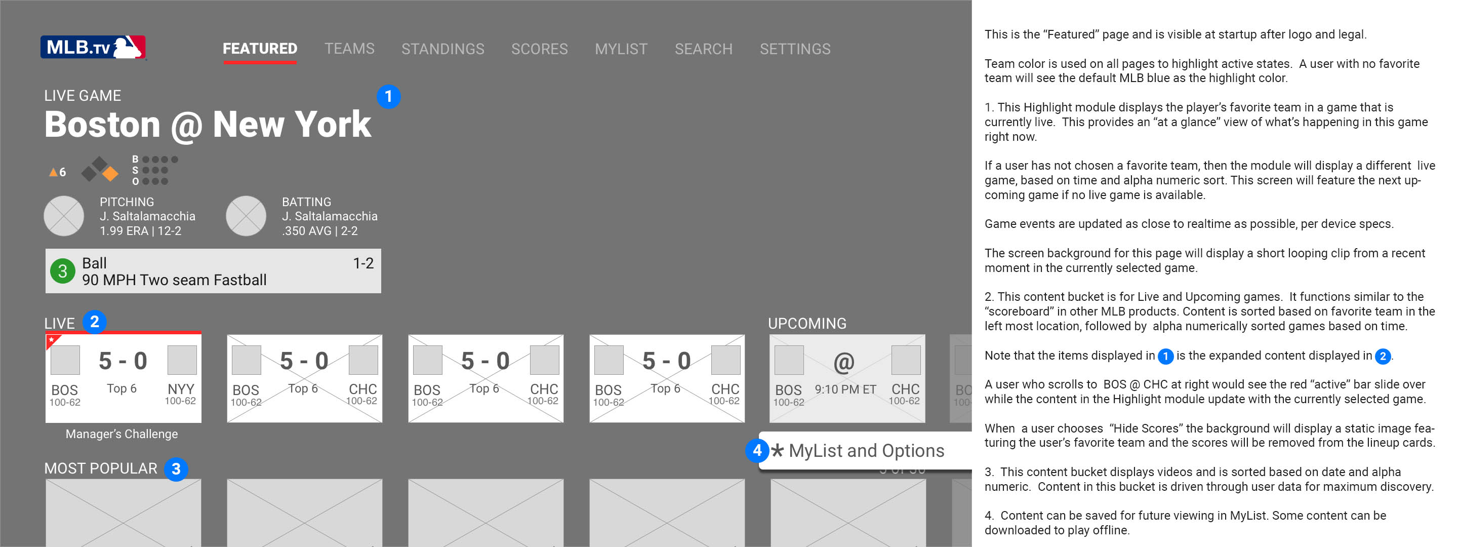
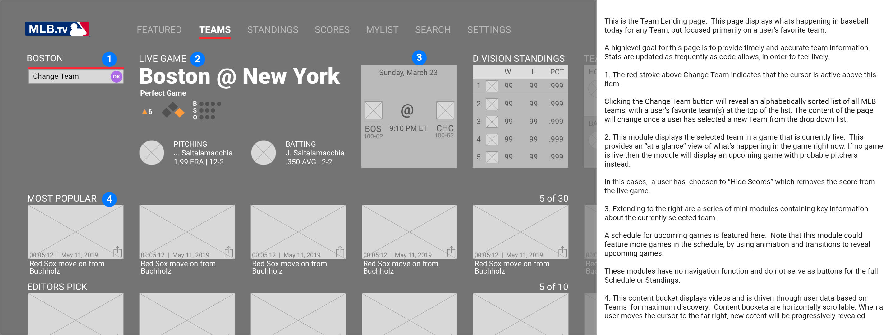
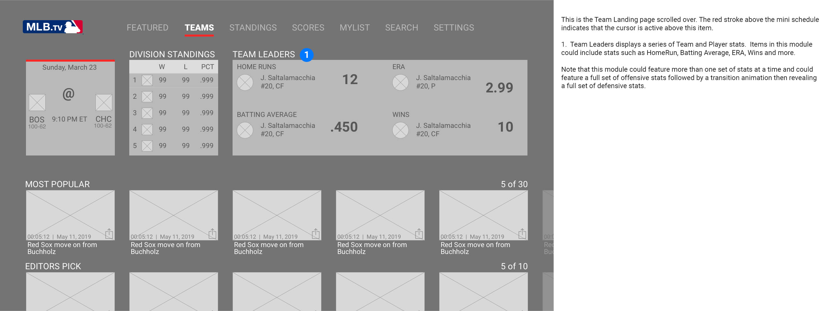
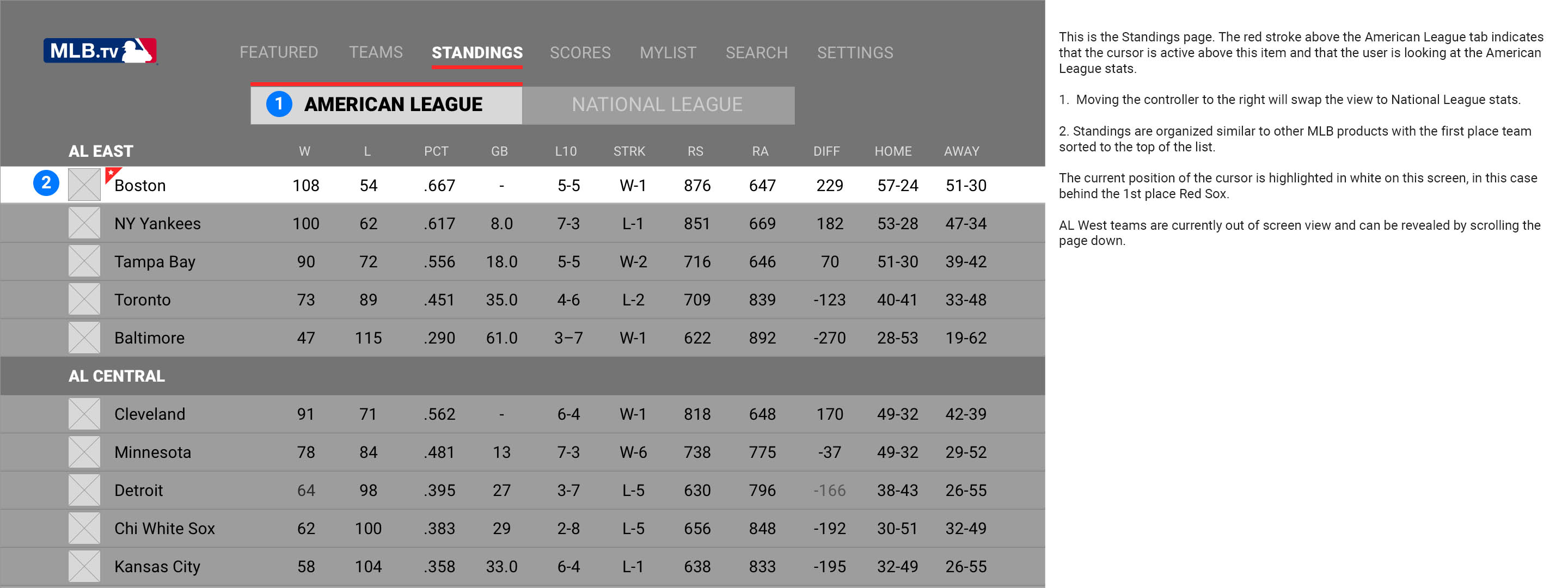
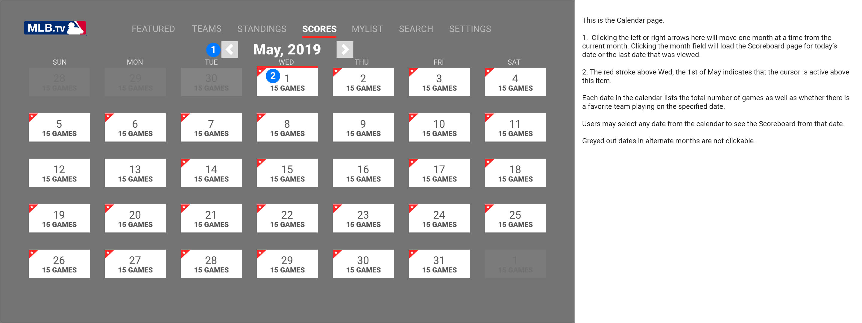
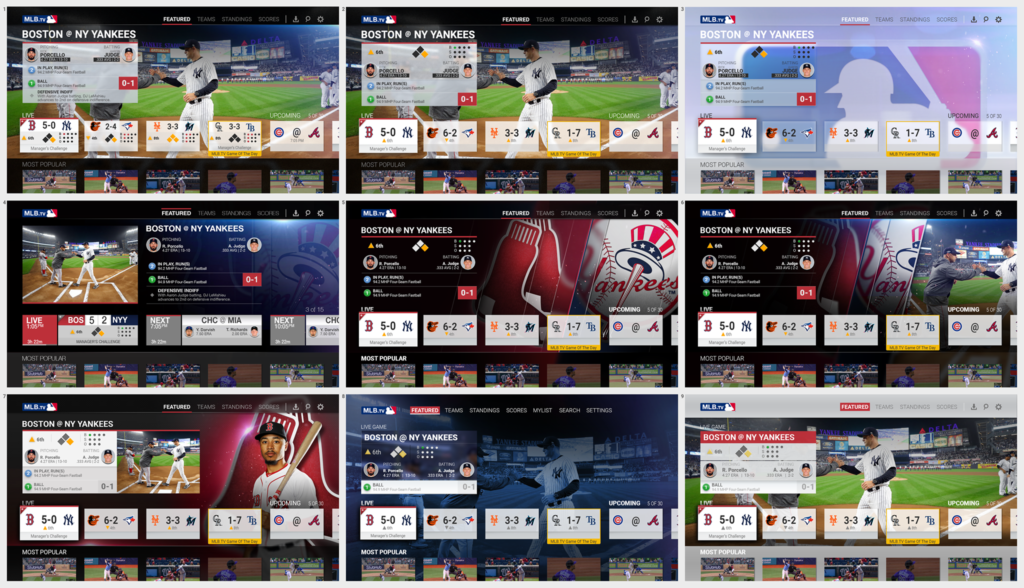
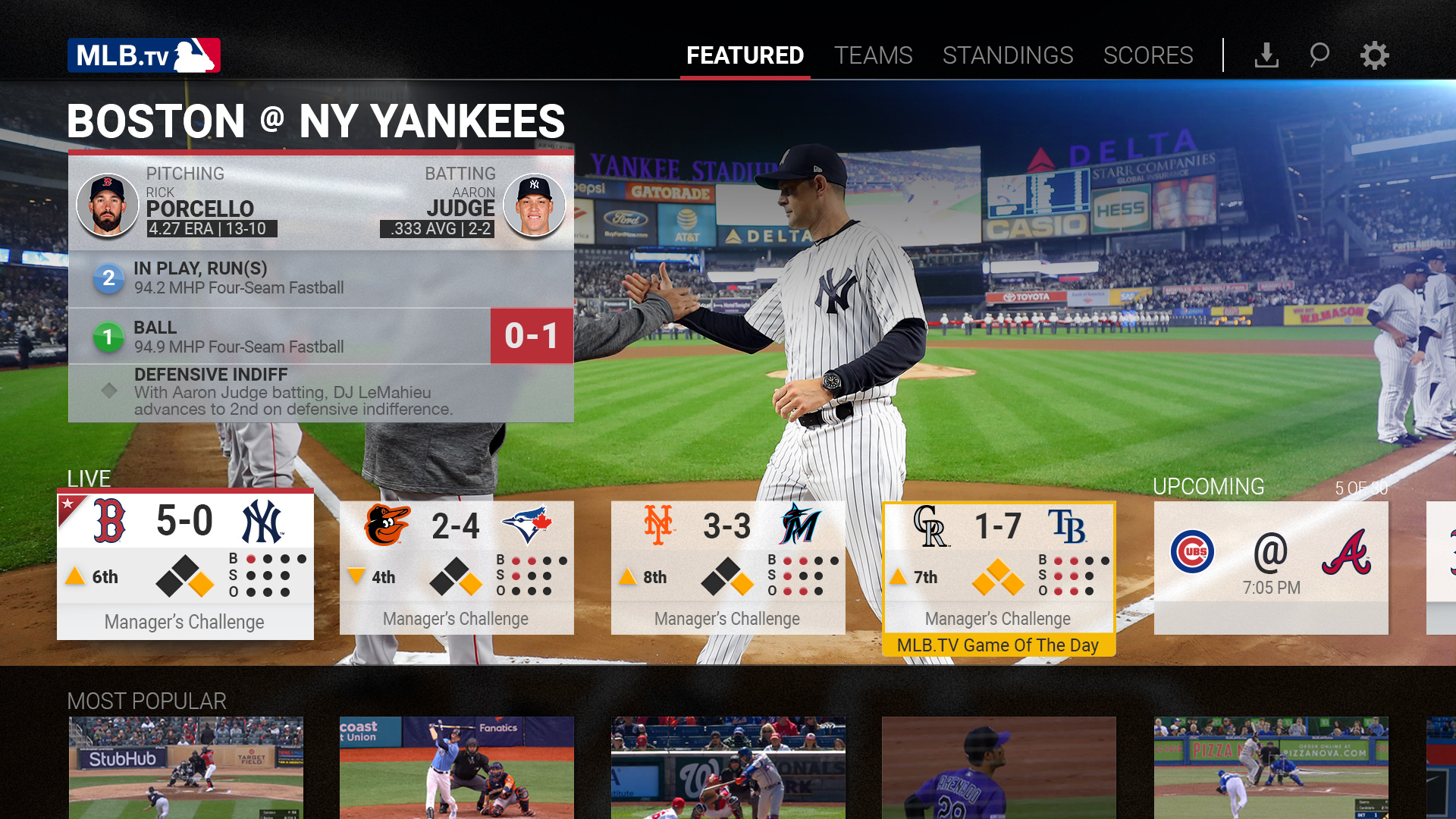
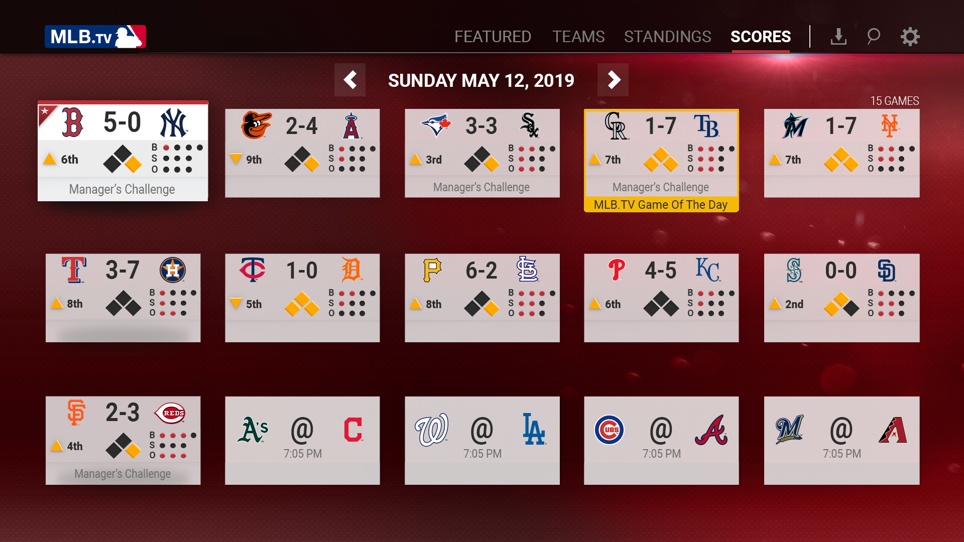
This product is designed primarily for a casual fan who has a favorite team and just wants to relax on the couch in front of their TV. To serve this fan, the experience should feel uncluttered, simple, and focused on providing quick access to what’s happening in baseball today. Highly engaged users will likely dig deeper into additional team, schedule, or standings pages, but the overall product must be focused on “the right content right now”.
UX Pillars
The perfect balance of data, discovery, and design.
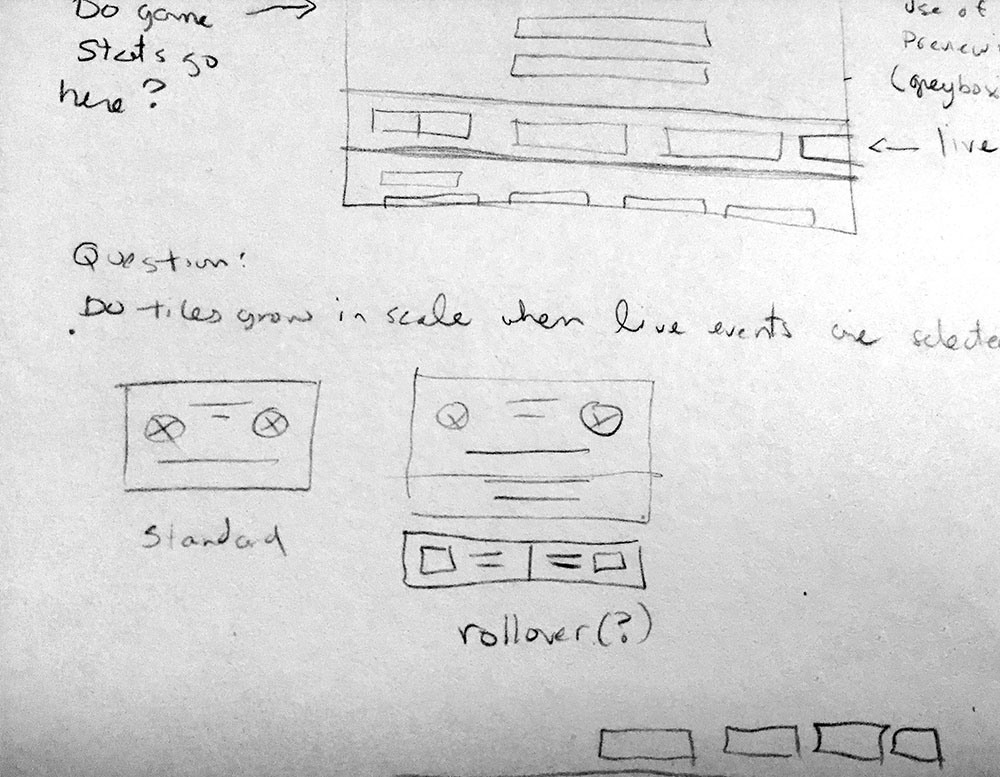
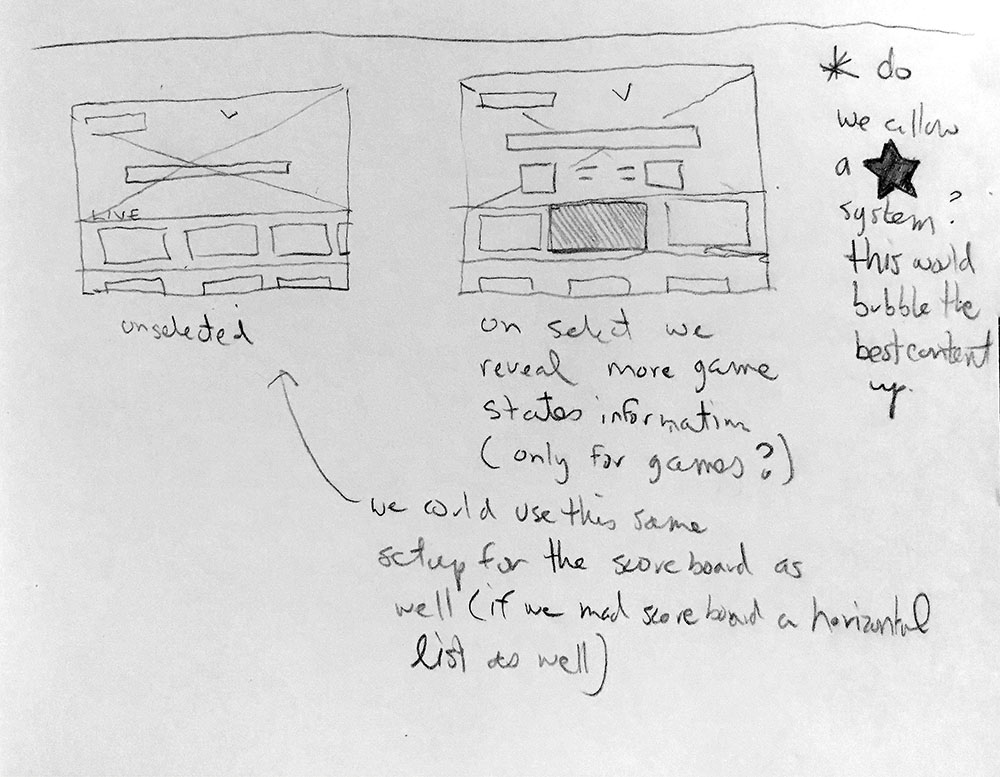
We started by researching the competitive landscape and by considering how users feel about existing mlb.tv offerings on different platforms. Creating a UX with a consistent visual style, low cognitive load and a mental model based on other “best in breed products” was an early goal.
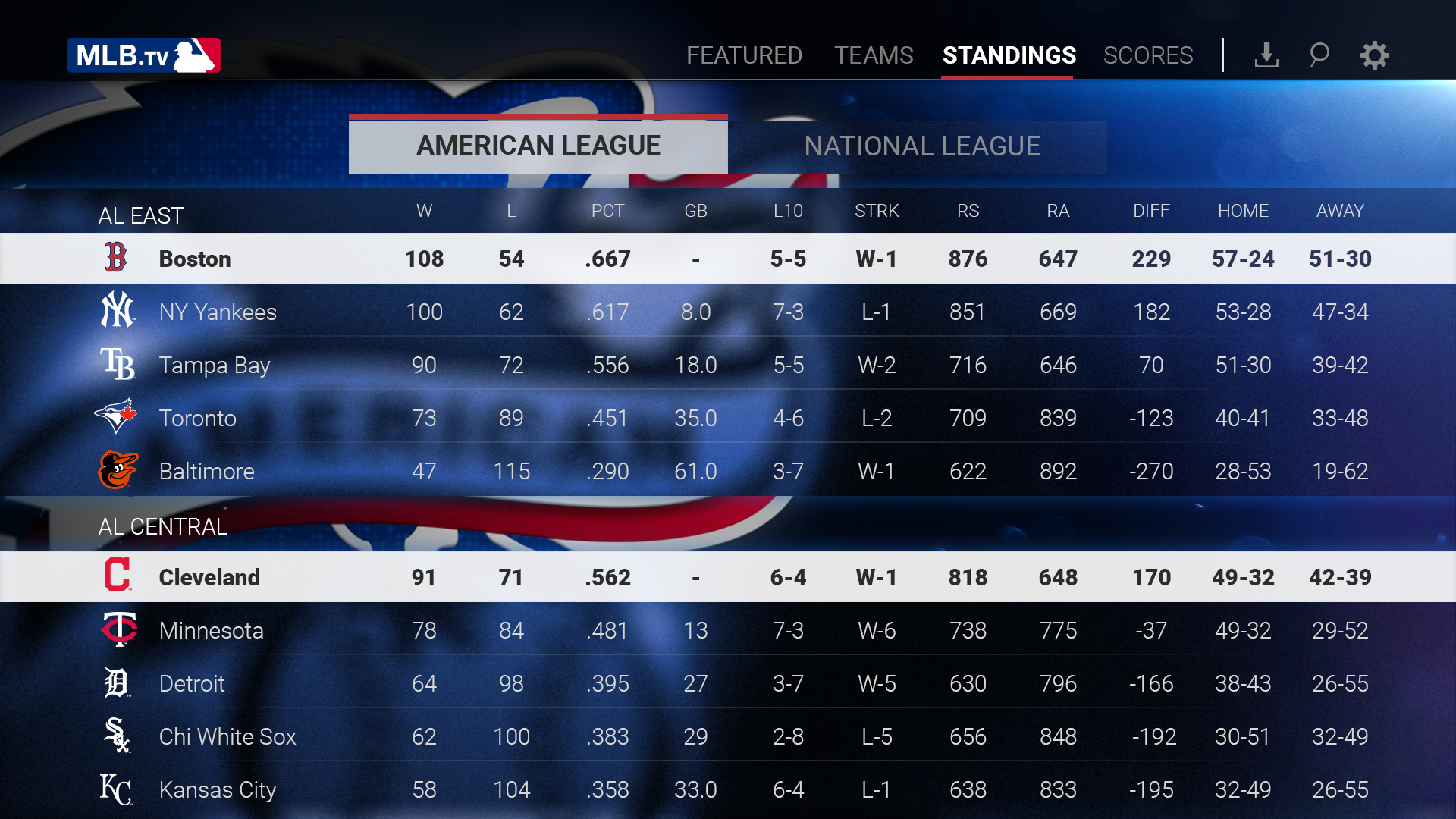
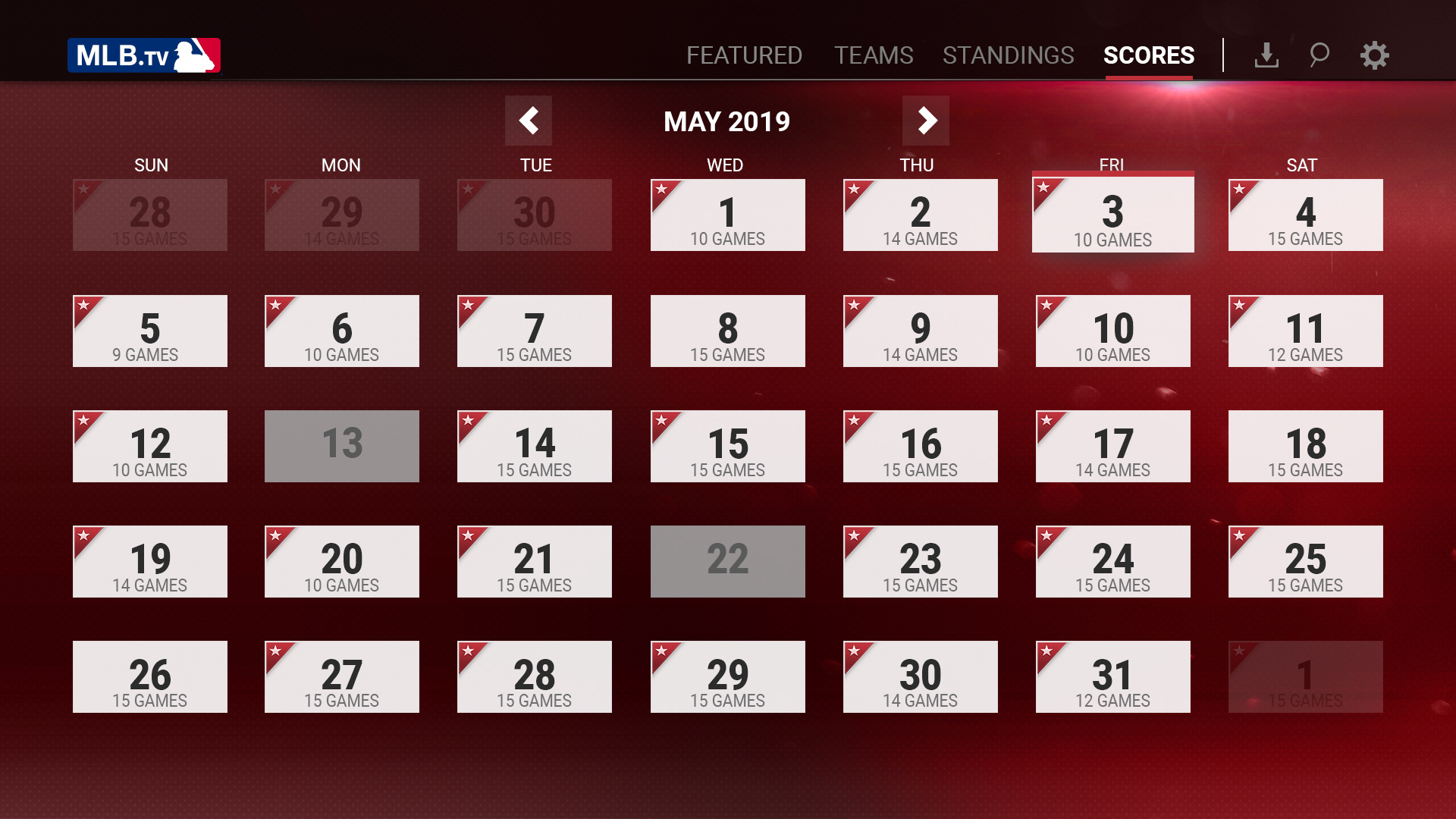
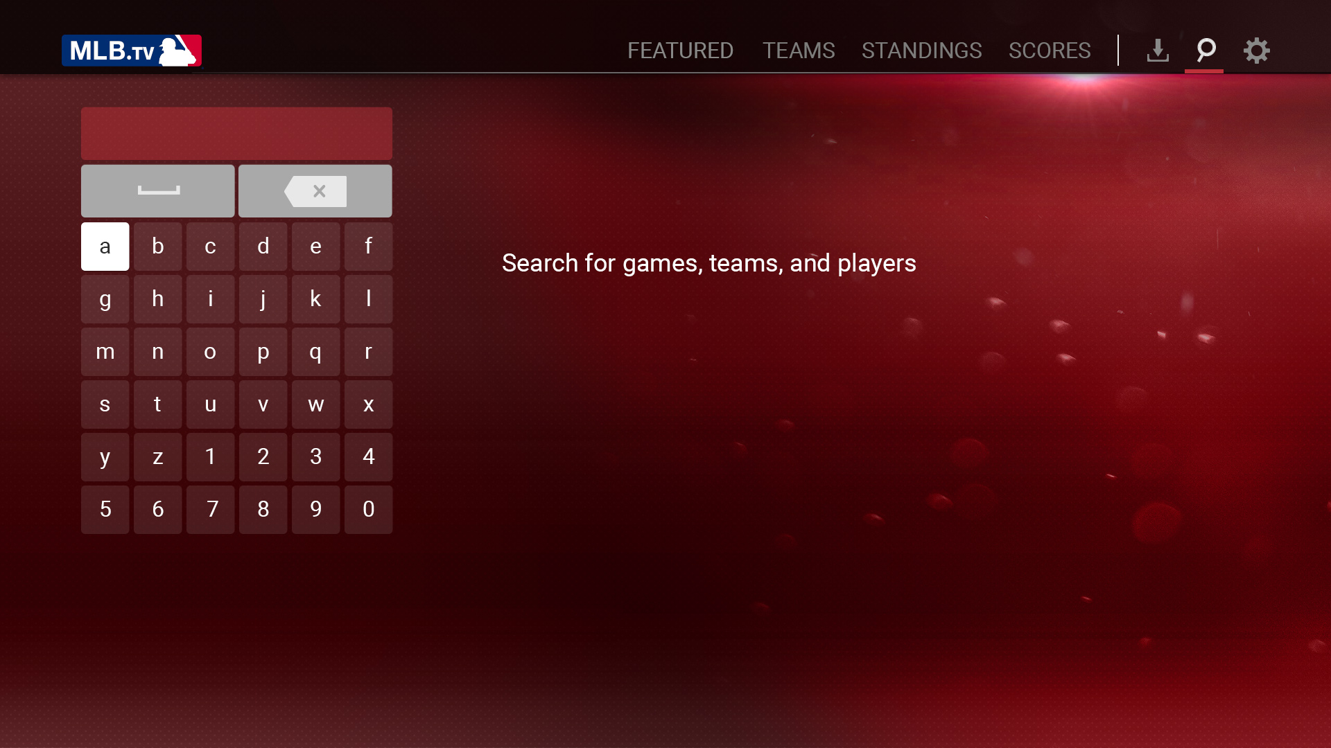
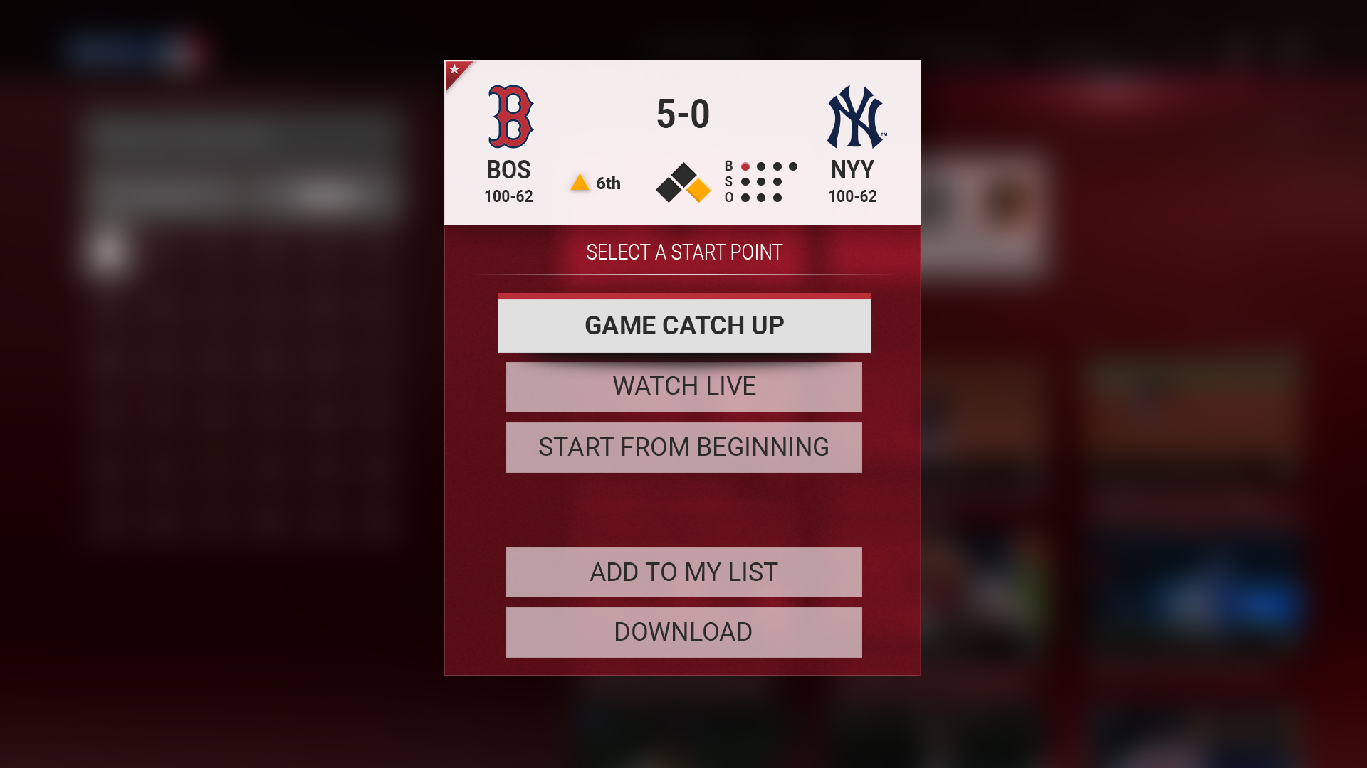
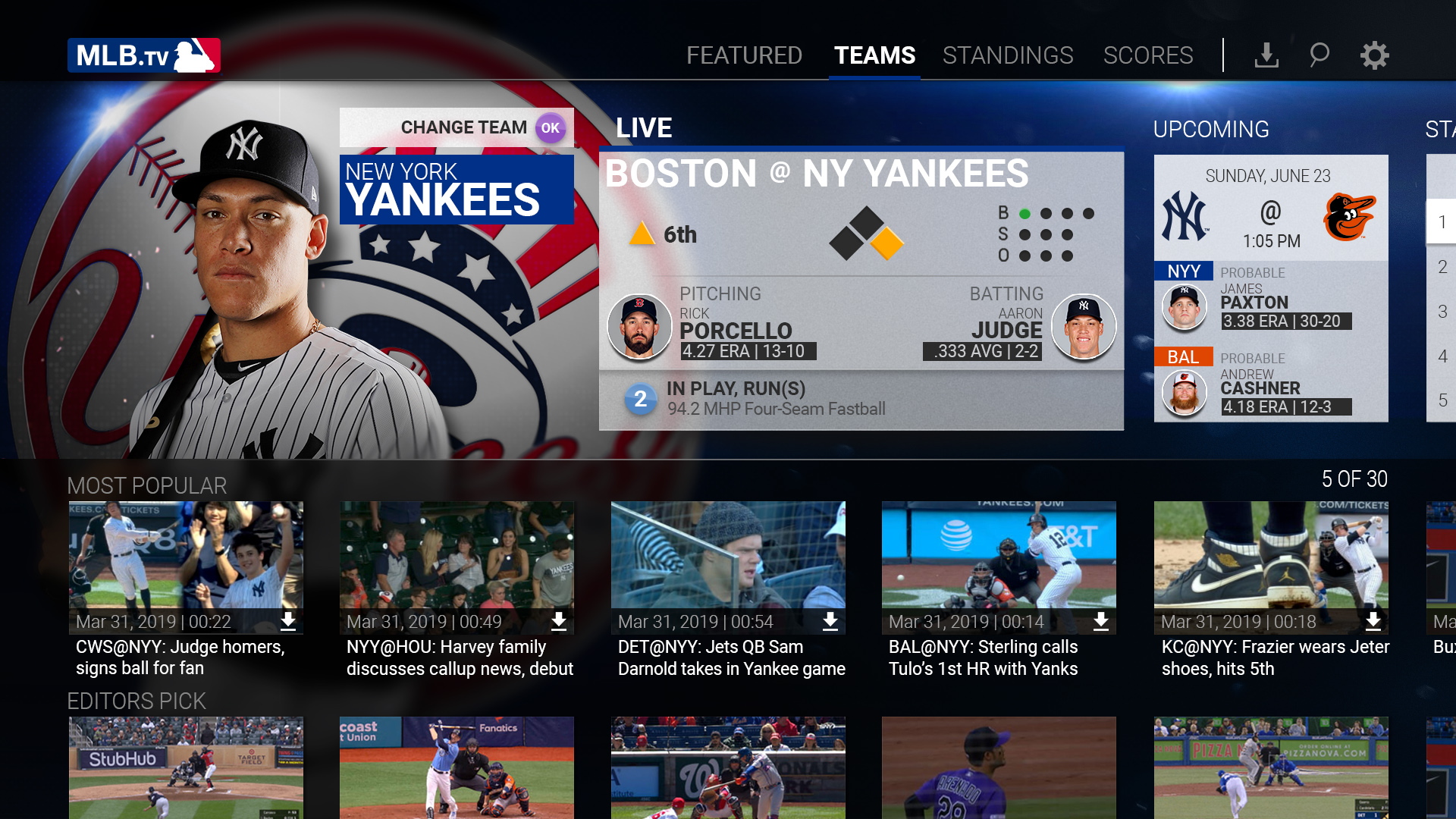
Product Focus
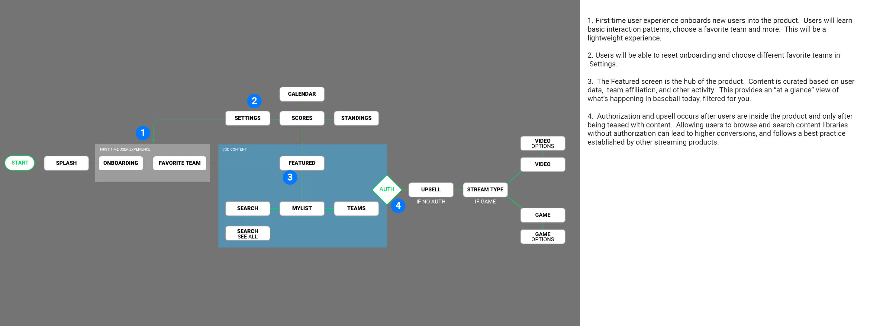
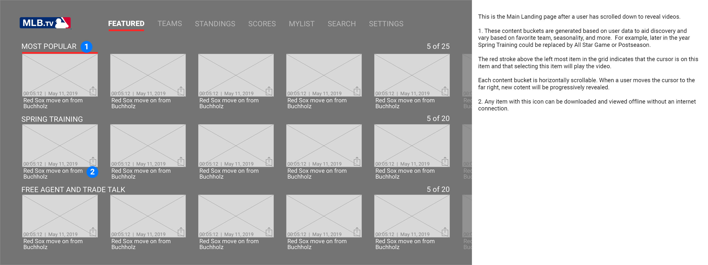
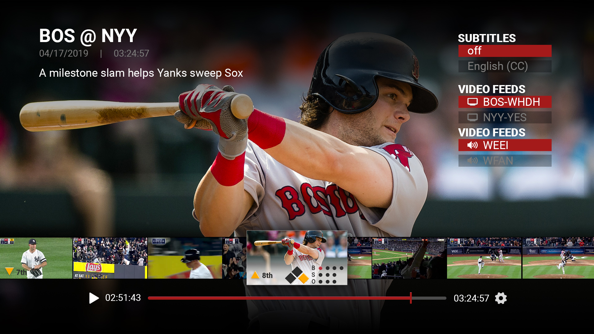
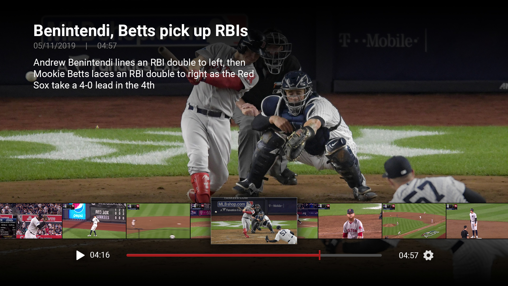
- Ease of discovery and quick access to content
- Gatekeeping as an upsell, not at App launch
- Lightweight consistent interactions
- Fluid and nuanced animations
- Progressive display of content
- Simplicity
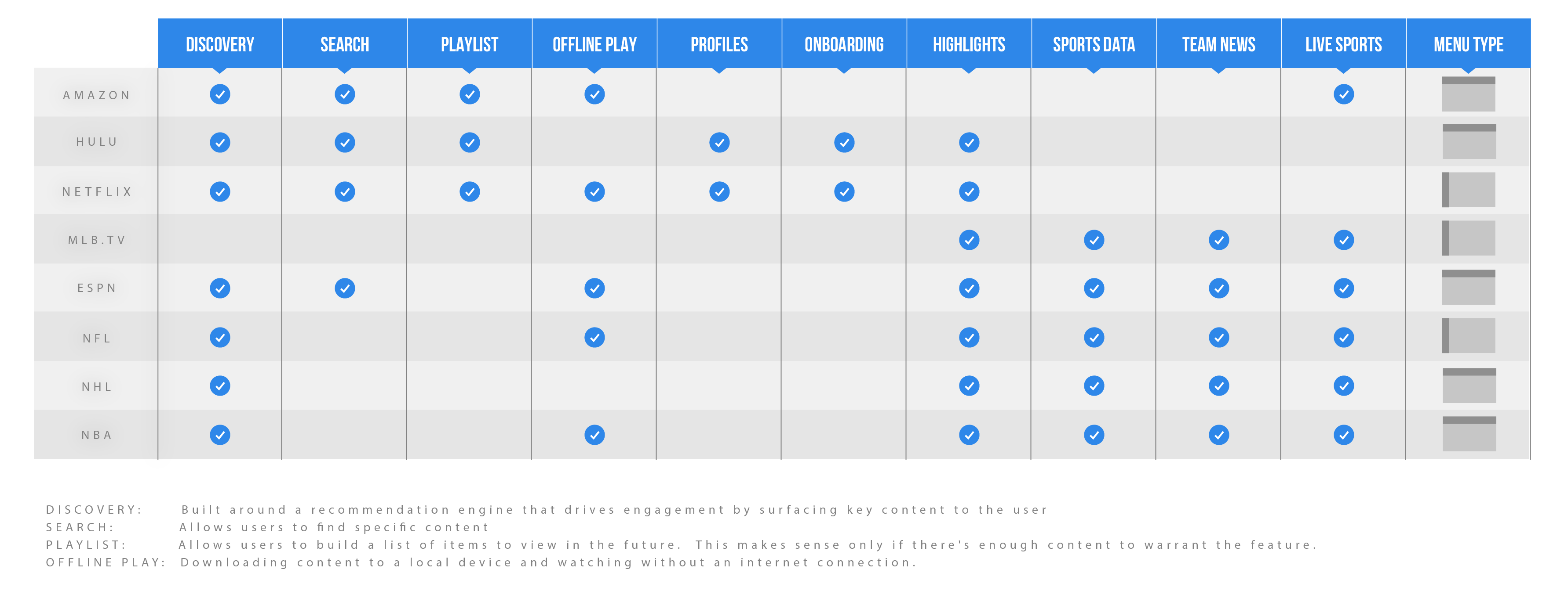
We concluded there is significant upside to a product overhaul, especially when considering MLB.TVs lack of features that drive engagement, retention, and subscription revenue.
Visual Design
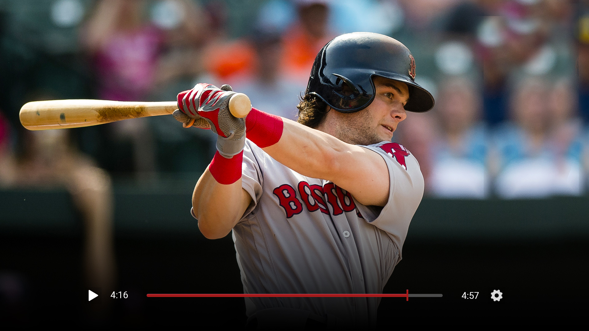
Sports products have a rich visual style that builds upon the inherent drama of the play. We found a balance between “broadcast style” graphics and simple visual design to create an atmosphere of excitement without overwhelming the user with excessive imagery. Our explorations paid homage to the existing MLB visual style and patterns. We aimed to push the brand forward while still tying into our legacy visual history.
Style + background variations
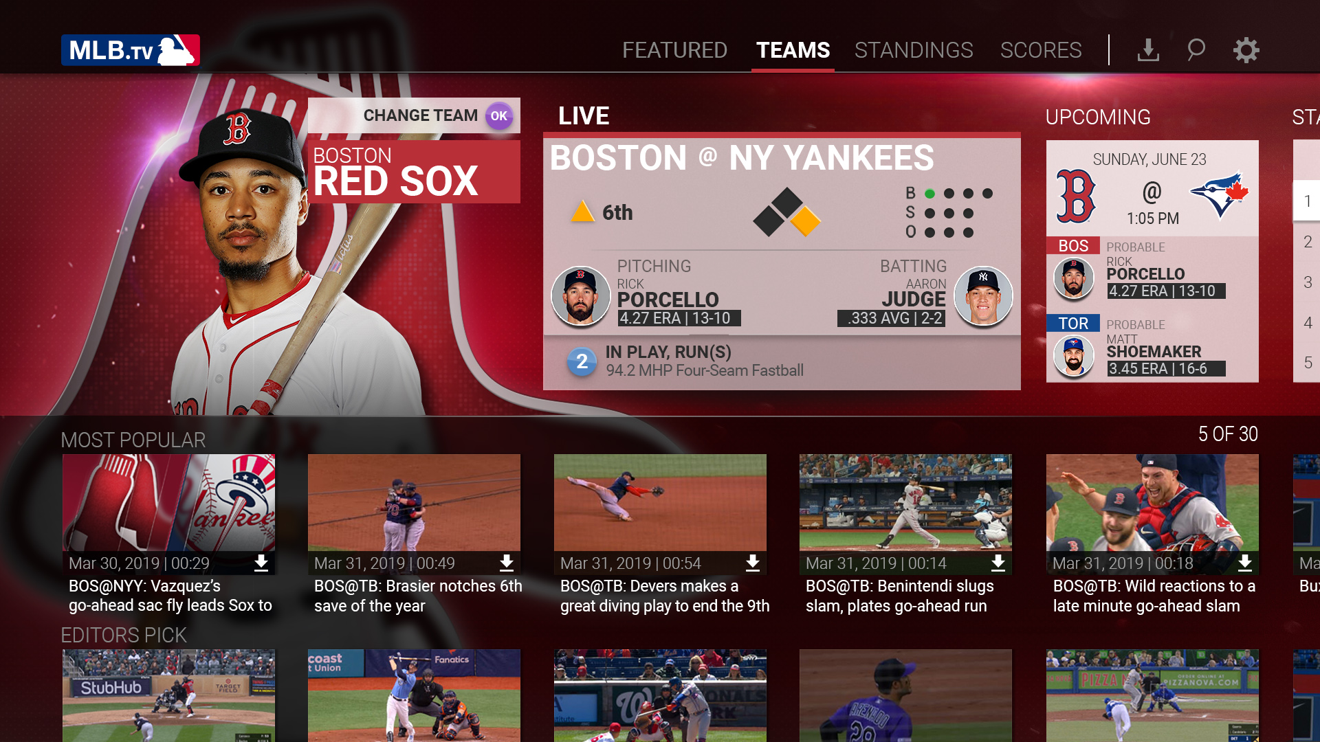
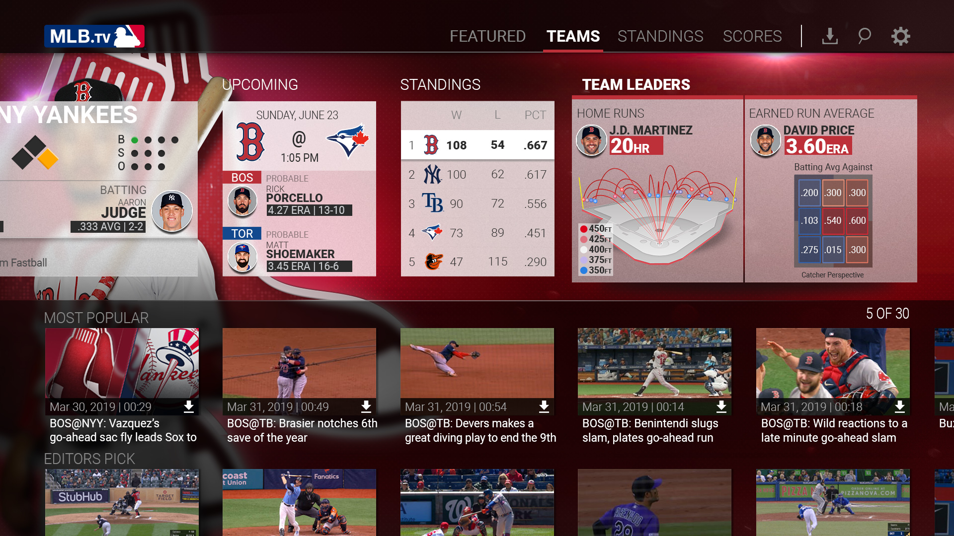
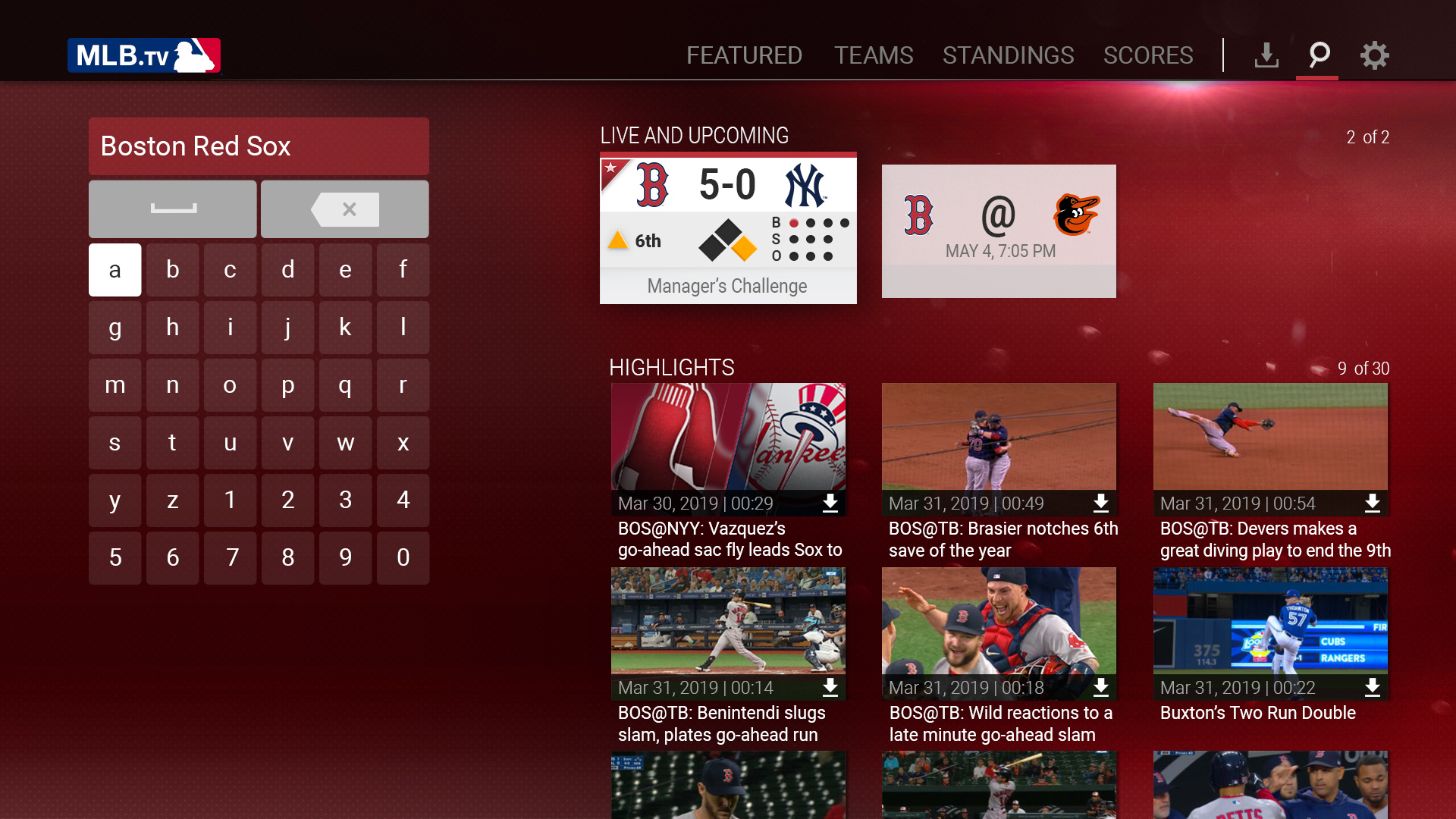
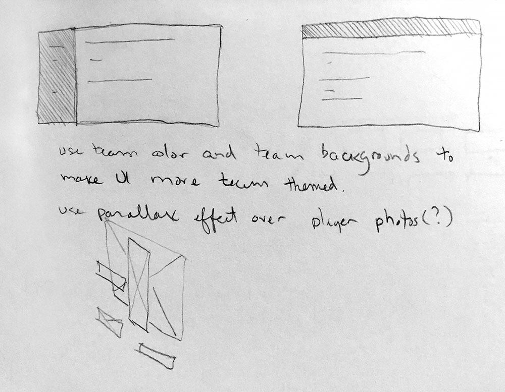
Team variation
Team affiliation is an intense point of pride for members of a tribe.
Using team-specific elements allowed us to delight fans with their players, logos, and colors in a way that sweats the detail and authenticity.
Motion Design
Great motion design brings a tangible sense of quality and excitement to a product. It’s all about the little details.
We began thinking about motion design while in the research and wireframing phase. For MLB, a polished style that elegantly ties into broadcast reinforces our brand. This was our opportunity to elicit an emotional response from our fans and set the tone with a high quality visual experience.
From the new MLB intro animation as a first point of entry to the numerous micro interaction animations, we aimed for simplicity, consistency, and lively transitions that feel rooted in the visual language of broadcast.